Tuesday, December 21, 2010
Exercise: Zen
Poster Project: Dances with Squirrels

Exercise: Snowman
Exercise: Flying Eye
Exercise: Smoke Type
Exercise: Illustrator Owl
Exercise: Light Text
Exercise: Casino Lights
Exercise: Bristle Brush Apple
Book Project: How to Get a Date
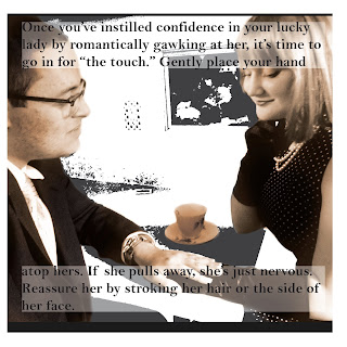
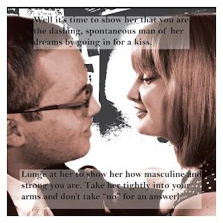
After I was finished with my images, I placed them into InDesign to lay everything out with text. I am quite happy with the result.
Friday, October 22, 2010
Sunday, June 20, 2010
Happy Fathers' Day!
Thursday, May 6, 2010
China Cat Sunflower Book


My idea for this project was to create a visual acid trip, so to speak. The poem is very visual, and for as long as I can remember, that is the only way I have been able to interpret it - as a series of images. To make it the personal piece that it is, I drew my own images and put them into Photoshop to enhance them, and to add photographic images. I tried to combine the sketches with the realistic images as well as I could. For example, the sunflowers on the first page are drawn, but the centers are distorted centers of real sunflowers. All together, this combination created the very surreal effect that I was trying to achieve. My Photoshop skills have greatly improved since the beginning of the semester, so I was very comfortable using it. Illustrator is a different story. All I wound up doing on illustrator was typing the text, but even that gave me trouble. Manipulating the path of the text took me almost as long as creating the images on Photoshop. In fact, that would become very obvious to anyone who saw my Illustrator file and highlighted the text paths - they are twisted and turned to say the least. But enough about the problems I had; I used the Myriad Pro font and placed it on a curvy, flowing path to give a sense of fluidity and movement. To complete my '60's effect, I printed the project on thick textured paper to make it look like an old sketch book. When I was printing, my printer apparently was not accustomed to printing on such thick paper, and so the ink splattered a little in some places, which definitely enhances the look I was going for. Overall, this project was very challenging, but I am very happy with the result, and plan to keep it for a long time.
Tuesday, April 13, 2010
Word Visualization Exercise
Monday, April 12, 2010
Poem for Book Project
by,
Robert Hunter
Look for awhile at the China Cat Sunflower
proud-walking jingle in the midnight sun
Copper-dome Bodhi drip a silver kimono
like a crazy-quilt star gown
through a dream night wind
Crazy Cat peeking through a lace bandanna
like a one-eyed Cheshire
like a diamond-eye Jack
A leaf of all colors plays
a golden string fiddle
to a double-E waterfall over my back
Comic book colors on a violin river
crying Leonardo words
from out a silk trombone
I rang a silent bell
beneath a shower of pearls
in the eagle wing palace
of the Queen Chinee
Self Visualization Project


The Basic Concept:
This is my self visualization project. The three panels are intended to be seen horizontally, in the order they are shown here, from top to bottom. The main idea is past, present, future. The middle image is my present; an isolated image from a hectic time in my life - college. The quote is from George Orwell's novel, 1984: "Sanity is not statistical." This quote is the central idea of the piece, meaning (in my own interpretation) that, while the majority rules, the majority is not always right. Growing up, I have always found myself out of place. Unpopular in a private school, white in an urban public high school... too rich for the inner city, too poor for suburbia... a pianist who can't read piano music, an artist in an academic school. Essentially, it is a rare occurrence that I am a part of the majority. Yet I am never fazed because I realize that not thinking like others does not make me wrong. This is where the quote comes into play. In the "past" and "future" images," I am surrounded by people. The "past" image is set in Jersey City, in front of a very typical scene of any inner city - a dry cleaner. As I've mentioned, I've never exactly fit in there. The "future" image is set in Paris (a very surreal Paris) because I aspire to end up there one day. Of course, I face the inevitable cultural barrier of any American among Parisians. Luckily, I have been prepared for it my whole life. Over all, my concept is my quote; though I may have a different mind set from the people who surround me, I can feel confident and secure that I am not wrong. And similarly, there is nothing wrong with being a part of the majority. I am just as different as any other person I meet.

Monday, March 22, 2010
Illustrator Photo Exercise

Illustrator Exercise 1
Sunday, March 14, 2010
Analysis: Abramovic, Kahlo, and Xiuwen
These three artists are women from very different backgrounds - Marina Abramovic is from Yugoslavia, Frida Kahlo from Mexico, and Cui Xiuwen from China - yet they all display a similar portrayal of women. Each artist concerns herself with depicting women in untypical circumstances, whether it be an uncommon role for women, an unusual setting, or a hidden side of the female psyche. Abramovic, Kahlo, and Xiuwen all use surreal subject matter to convey their messages about women.
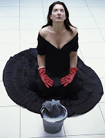
Marina Abramovic: Abramovic’s pieces are all distinctly hers; not only because her body of work is nearly entirely comprised of self-portraits, but because she has a recognizable style. Compositionally, the majority of her pieces are centered, and relatively symmetrical. She carefully crafts each scene she captures, precisely placing every object in the composition, and leaving no detail to chance. Most of her pieces concern discomfort, or a feeling of being out of place. Abramovic portrays a woman who is uninterested in her expected role as a submissive housewife by placing her in unnatural scenes and using minimal, dull color.
Cleaning the House, Marina Abramovic

Frida Kahlo: Kahlo is also known mostly for her self-portraits, but, just as Abramovic, has a very recognizable style. She paints in earthy colors and generally depicts robust, weighty figures; these are not women who exude feminine beauty, but are nonetheless confident in appearing front and center in any painting. Kahlo’s women are usually placed in grim, foreboding scenes, which often make a political or social statement. Her figures never smile, nor do they frown - regardless of her surrounding scene, Kahlo’s women wear neutral faces. Her paintings evoke emotion in viewer through the lack of emotion in figure.
Tree of Hope, Frida Kahlo

Cui Xiuwen: Unlike Kahlo and Abramovic, Cui Xiuwen portrays soft, feminine figures. Her use of vibrant colors and angelic figures enhance and contrast the serious, severe situation of each girl. Xiuwen focuses on the hardship of young pregnancy, and is primarily concerned with portraying the emotion of her figures. Unlike Kahlo, she evokes an emotional response in the viewer through the emotion consuming the depicted girl in the piece. Lonely, solemn, pale, pensive girls are focal points of each piece. Every girl remains isolated even when there are other figures in the scene. Xiuwen’s works embody the hopelessness and despair of young pregnant girls to which outsiders are usually blind.
Angel No. 11, Cui Xiuwen
Overview: Each artist has a very different, distinct style, and it is very interesting to see the variety of ways in which each artist conveyed her message. All three have a great talent for communicating with the viewer. I thoroughly enjoyed analyzing each artist's body of work.
Wednesday, February 24, 2010
Photoshop Project 1
Monday, February 15, 2010
Friday, February 12, 2010
Analysis: Artists Analyses
Wall: "interesting lighting," "everyday life," "subtle," "philosophical," "lyrical"
Hocks - "interesting process," "whimsical," "interesting subject matter," "surreal," "off-beat," "curious," "dream-like"
Crewdson - "dark," "vacant," "dreary," "powerful," "deep tones," "unique," "cinematic," "painstakingly intricate," "mysterious," "haunting"
Sherman - "appealing," "vintage," "innocent yet devious," "eerie type of glamour," "classic," "feminine beauty"
Thank you, class, for your interesting analyses! I was pleasantly surprised.
Exercise 1
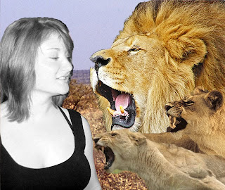
Review: Inherited Traits Exhibit
While walking around before the presentation, I was very struck by one piece in particular. In the middle of the back wall, I saw a large, thin metal structure with what appeared to be a bowl with legs suspended from it. The complexity that the overall simplistic structure embodied was very beautiful on a visual level; it had a captivating presence. I was intrigued, but did not understand it. I later learned that this piece was Heidi Kumao’s Translator. Kumao explained in her presentation that Translator was a commentary on the impact that domestic disputes have on a young child - a girl, in this case. This girl is seen switching back and forth between parental figures, each’s words seeping into her bones. Kumao portrays a very raw picture of family in her art, without neglecting the piece’s aesthetic value. After learning the meaning behind Translator, I found a deeper appreciation for the piece. By far, this was my favorite piece in the exhibit.
Overall, it was a terrific show, and I was very glad to have been a part of the experience.
Saturday, February 6, 2010
Analysis: Wall, Hocks, Crewdson, and Sherman
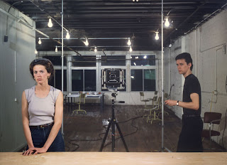
Jeff Wall: While the viewer is aware that the scenes created by Wall are staged, the figures in the scenes are strangely natural, as if not noticing that they are being photographed. Wall’s false realities are intriguing and beautifully portrayed. Each piece conveys a narrative.
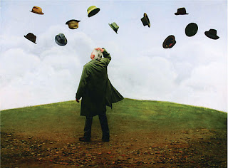 Teun Hocks: Hocks’ photos are set in a sort of dream world. Each figure is dropped into a fantasy, leaving the viewer to imagine what is happening, and what the outcome of the figure’s quandary will be. Hocks’ use of color and subject matter are entertaining and thought-provoking.
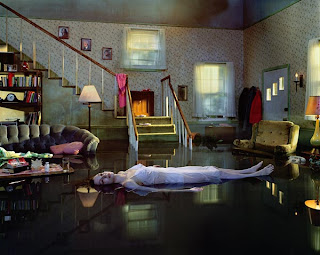
Gregory Crewdson: Crewdson’s use of vivid colors, and overall precision make his photos look as if they are movie stills. It is clear that the artist had a vision and was very precise about placement of every aspect of the shot. As Hocks’, Crewdson's images have a fantastical quality, but in a darker sense.

Cindy Sherman: Sherman uses black and white photography to portray beautiful, classical women in a quirky light. Each of her photos implies a certain, but vague narrative, inviting the viewer to guess what is really happening behind each pretty face.
Overview: At a first glance of each artist, I was sure that Cindy Sherman’s work would be my favorite because it is very much my style. However, while I do find her work beautiful, I am not sure that I can say I prefer one artist over another. Each photographer has incredible work, and in each one of their portfolios, I found several pieces which absolutely captivated me. I was pleasantly surprised by each portfolio, and I hope to see some of these collections in person some time in the near future.
Monday, February 1, 2010
Inspiration


