I had a few problems with this exercise, mostly because I was unable to download the necessary elements to do it correctly. But overall, I learned a lot of the fundamentals about working in Photoshop.
Tuesday, December 21, 2010
Exercise: Bristle Brush Apple
This was a pretty cool exercise. I learned about using different brushes in Illustrator, and I came up with a nice, painterly result which I would not have expected from a computer.
Book Project: How to Get a Date
This project was my first experience with Adobe InDesign, but I also used Illustrator and Photoshop. My idea was to create a step-by-step parody on how to get a date. I had my sister and her friend dress up for a photo shoot. Then, I manipulated the figures from the photos in Photoshop and the backgrounds in Illustrator. Here are a couple of pages from the final product:
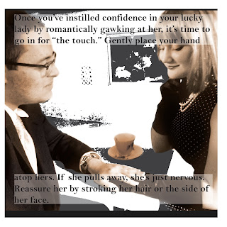
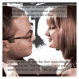
After I was finished with my images, I placed them into InDesign to lay everything out with text. I am quite happy with the result.


After I was finished with my images, I placed them into InDesign to lay everything out with text. I am quite happy with the result.
Friday, October 22, 2010
Sunday, June 20, 2010
Happy Fathers' Day!
To my most loyal - and only - subscriber,
Thanks for your devoted attention to my silly blog. Expect more art work soon. I'm working on some stuff. Happy Fathers' Day, Daddy. I love you! Stay cool.
Elena
Thursday, May 6, 2010
China Cat Sunflower Book


My idea for this project was to create a visual acid trip, so to speak. The poem is very visual, and for as long as I can remember, that is the only way I have been able to interpret it - as a series of images. To make it the personal piece that it is, I drew my own images and put them into Photoshop to enhance them, and to add photographic images. I tried to combine the sketches with the realistic images as well as I could. For example, the sunflowers on the first page are drawn, but the centers are distorted centers of real sunflowers. All together, this combination created the very surreal effect that I was trying to achieve. My Photoshop skills have greatly improved since the beginning of the semester, so I was very comfortable using it. Illustrator is a different story. All I wound up doing on illustrator was typing the text, but even that gave me trouble. Manipulating the path of the text took me almost as long as creating the images on Photoshop. In fact, that would become very obvious to anyone who saw my Illustrator file and highlighted the text paths - they are twisted and turned to say the least. But enough about the problems I had; I used the Myriad Pro font and placed it on a curvy, flowing path to give a sense of fluidity and movement. To complete my '60's effect, I printed the project on thick textured paper to make it look like an old sketch book. When I was printing, my printer apparently was not accustomed to printing on such thick paper, and so the ink splattered a little in some places, which definitely enhances the look I was going for. Overall, this project was very challenging, but I am very happy with the result, and plan to keep it for a long time.
Subscribe to:
Posts (Atom)


